Ollio Sponsorship Management

5 Developers
1 Designer
Overview
Project Context
Ollio is a B2B sponsorship management platform that connects brands and independent creators through streamlined workflows.
Problem
Brands and creators rely on scattered email threads, shared docs, and inconsistent communication to settle on sponsorship deals—making the process both time-consuming and unorganized.
· Creating sponsorship proposals on the brand side
· Reviewing, and accepting deals on the creator side
Solution
A deal-tracking mobile application for creators &
a sponsorship management web dashboard for brands.
For Brands
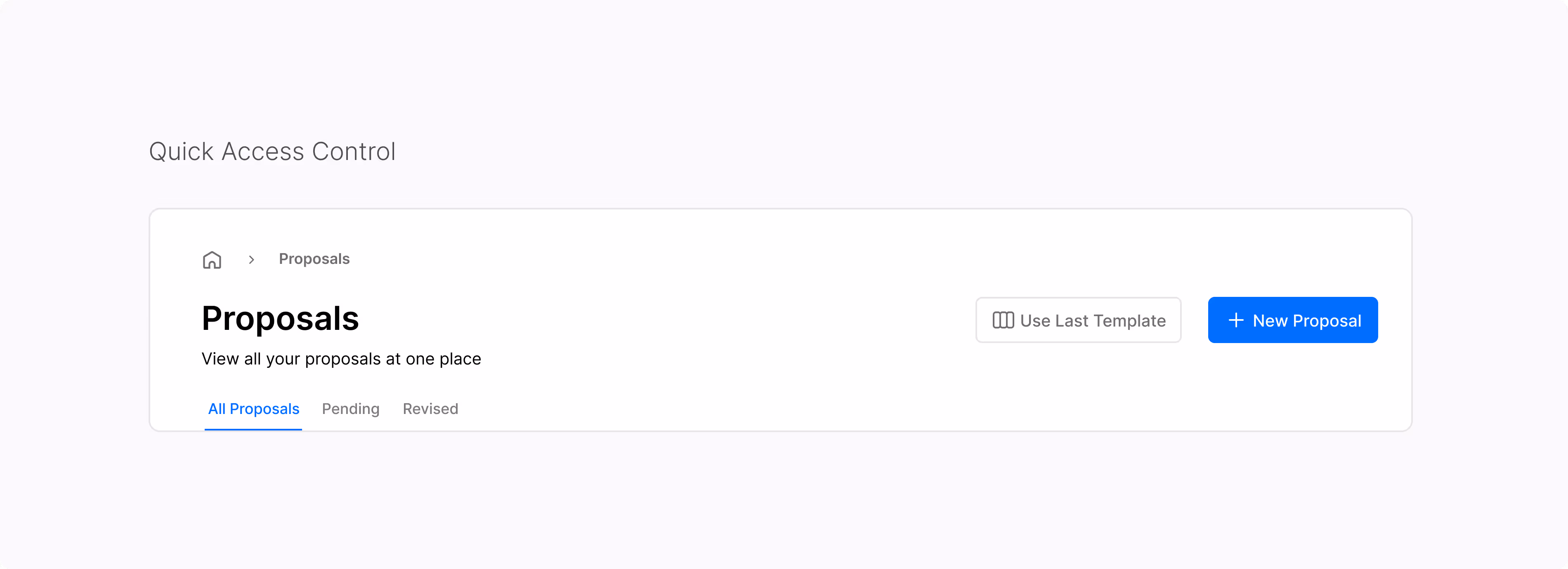
Proposals Made Simple
· Manage all sponsorships in the format that all marketers have known and love - Excel table
· Track which proposals are pending, viewed, or revised
· Use a deal template to skip repetitive setup and ensure all key terms are included every time.
· Use quick reply options like “Accept,” “Request changes,” or “Decline” to keep things moving fast.
Research
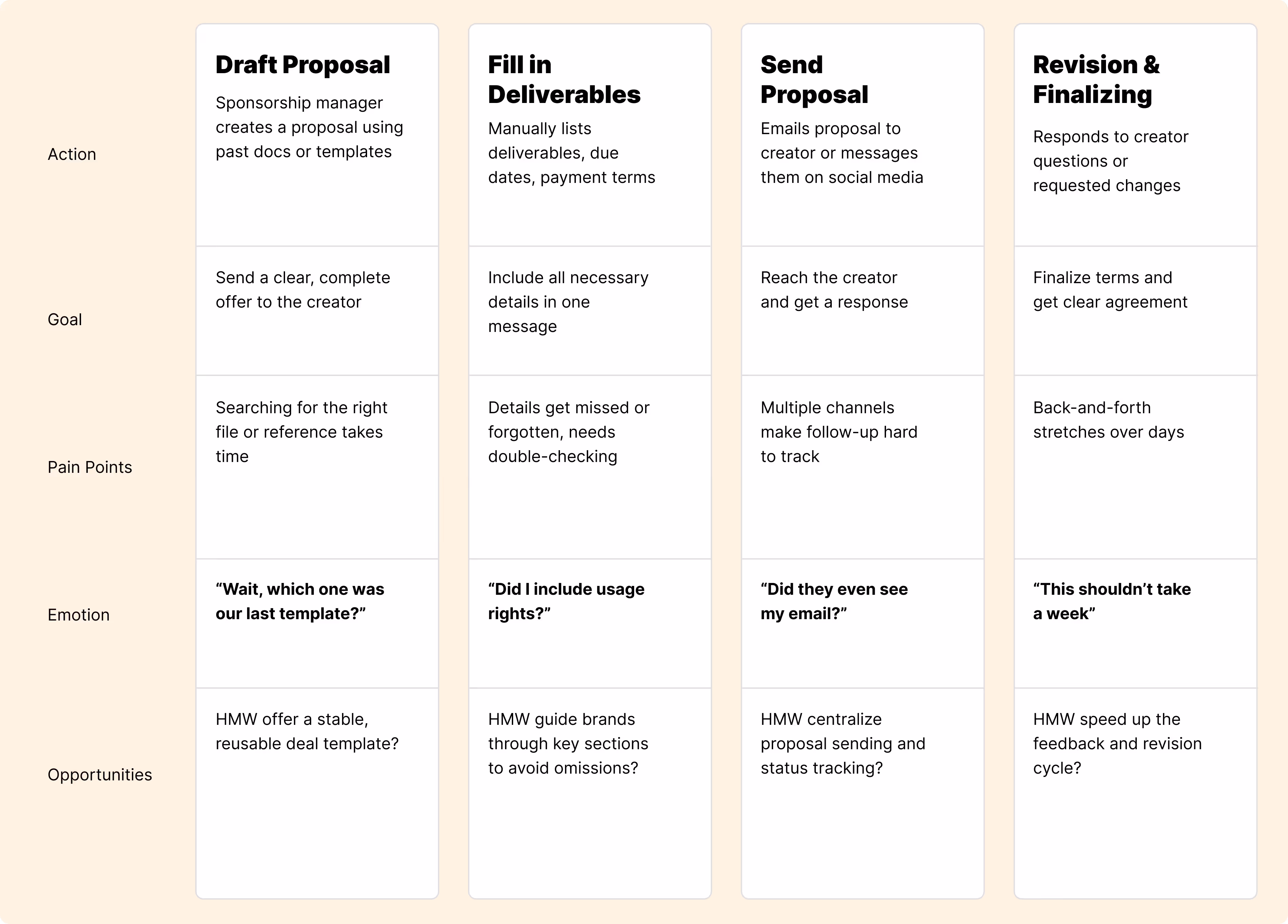
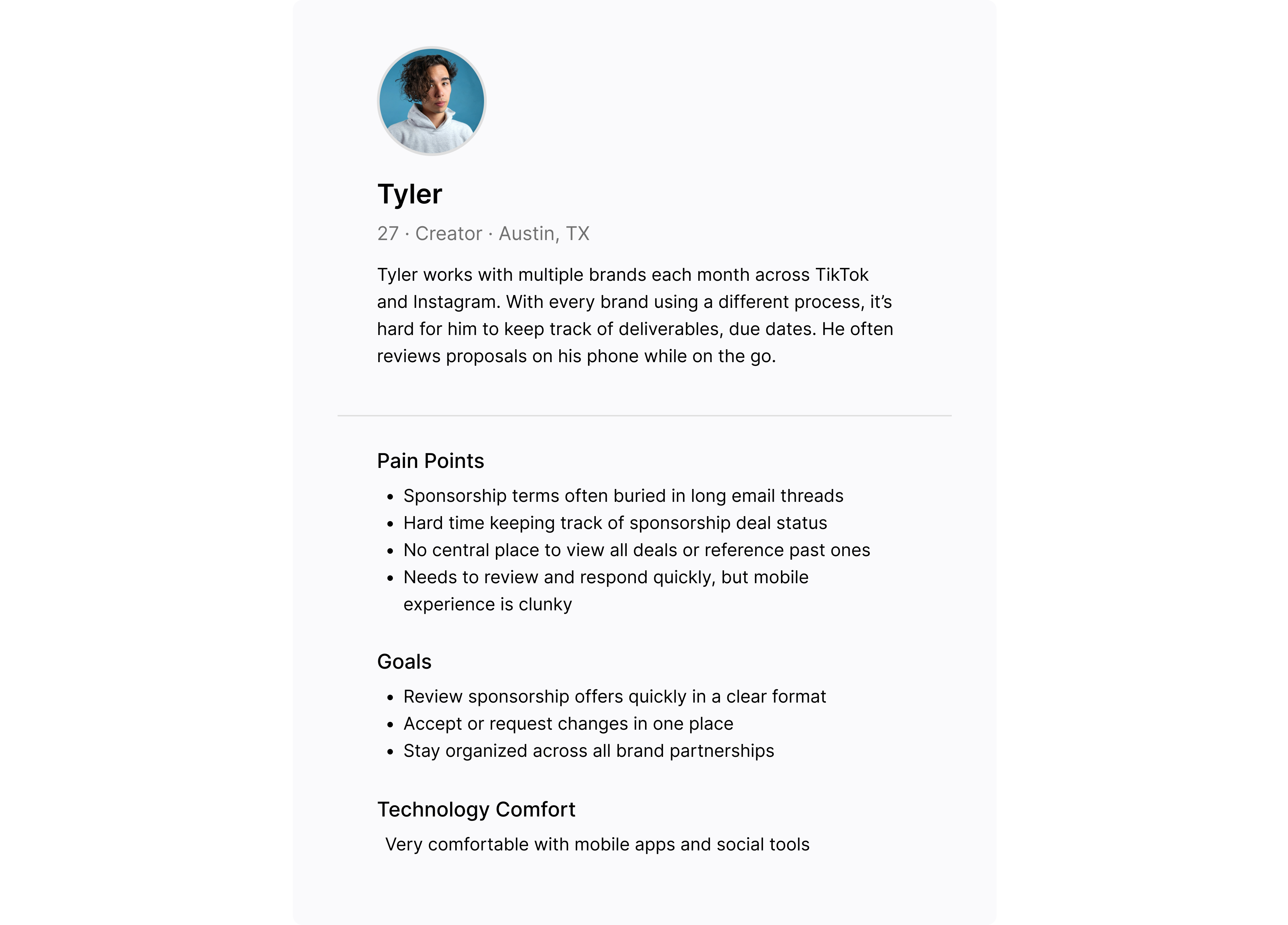
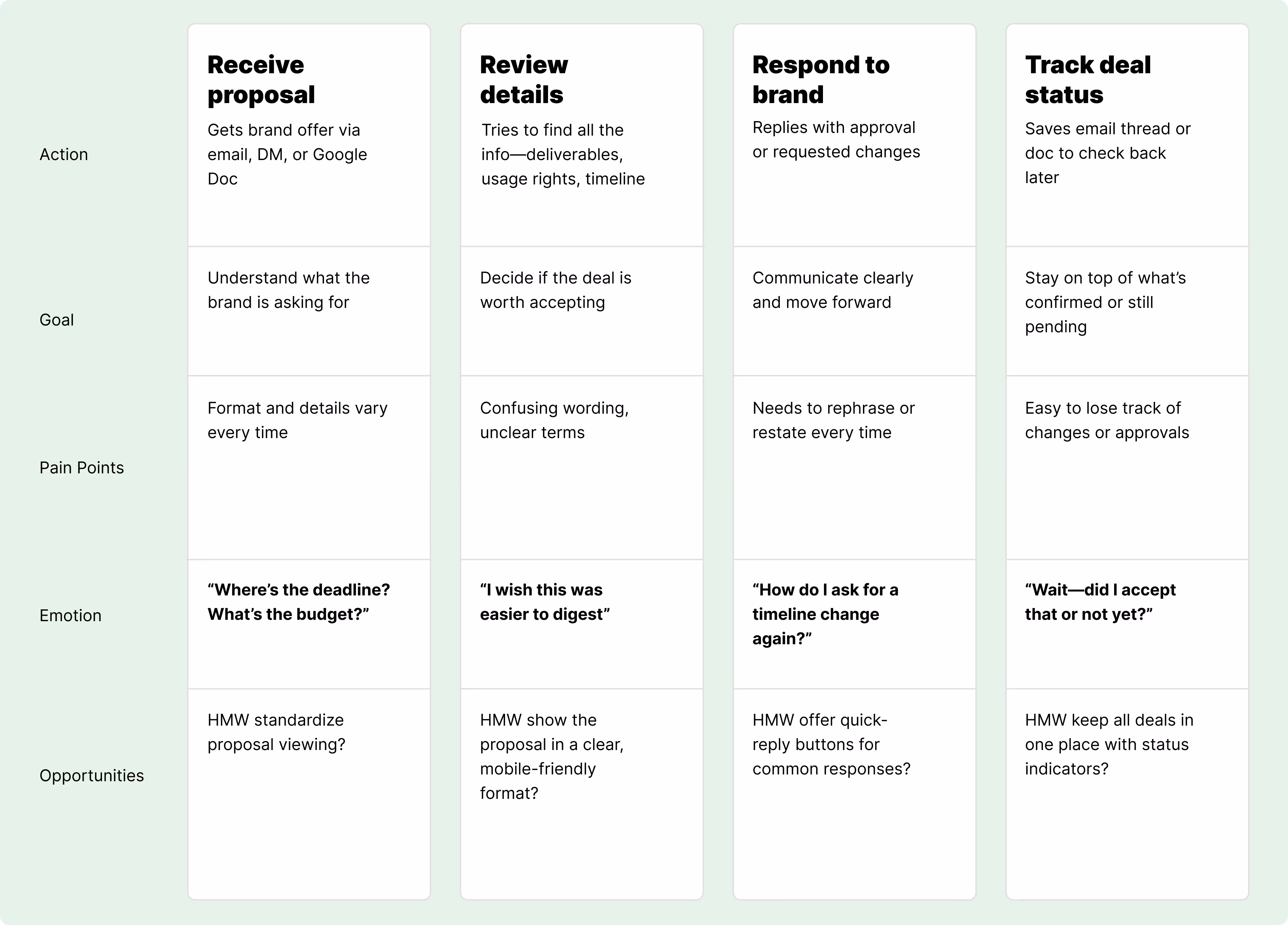
Stakeholder and User Interviews
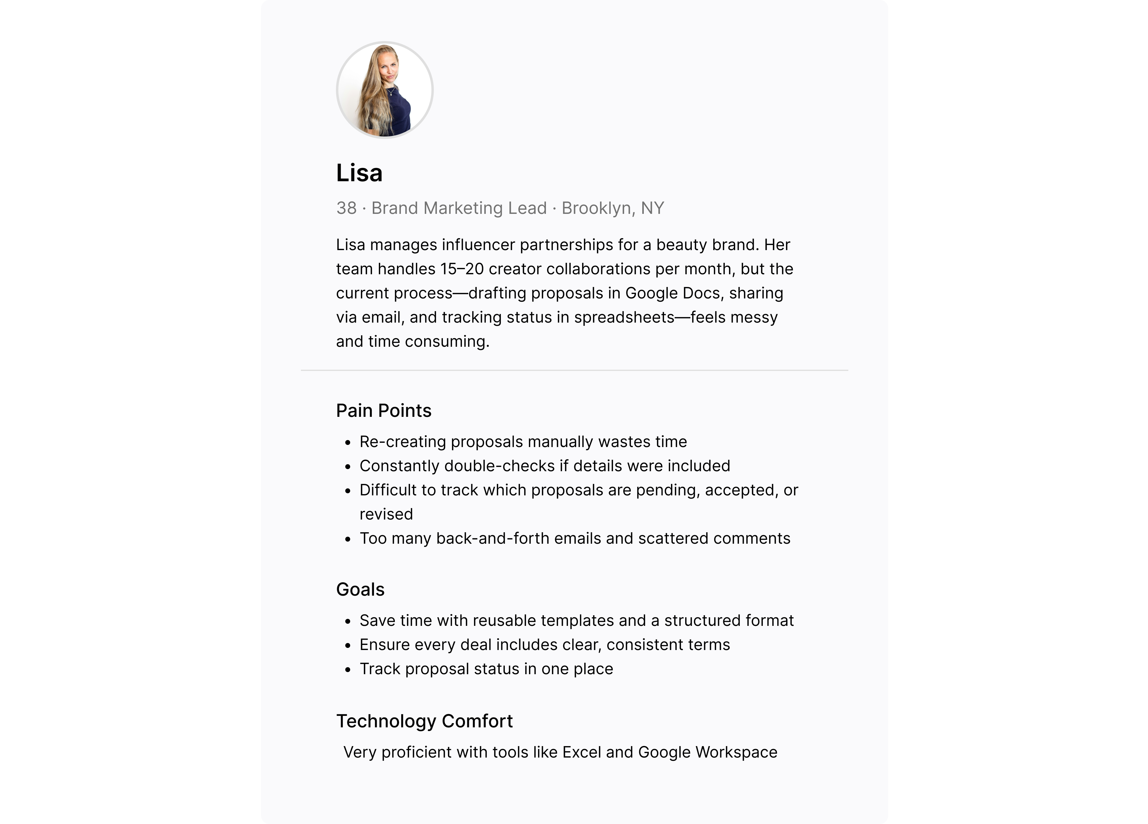
I conducted interviews with 2 brand managers and 3 independent creators to understand the current sponsorship workflow and pain points on both sides.
Through these conversations, supported by personas and journey mapping, I uncovered key behavioral patterns that contribute to the time-consuming, fragmented nature of dealmaking—ultimately informing areas for improvement in Ollio’s platform.
Brands
Ideation
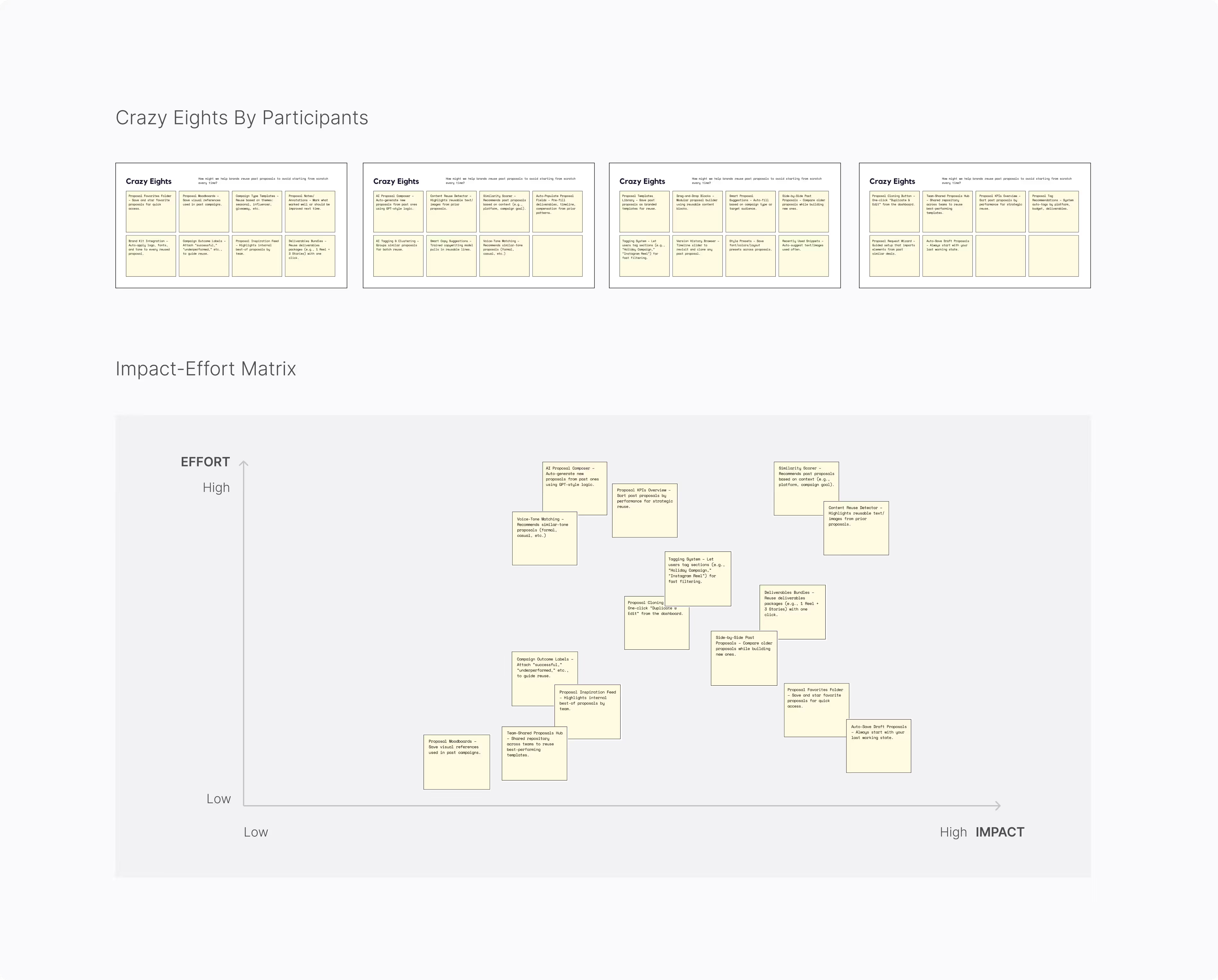
Ideation Workshop
Based on the user behaviors, pain points, and goals we uncovered, I identified four key opportunity areas and translated them into How Might We prompts to guide the ideation process.
Brands
· How might we help brands reuse past proposals to avoid starting from scratch every time?
· How might we guide brands through adding key deliverables without missing critical info?
· How might we provide quick response options for accepting or revising deals?
Using the “How Might We” framework, we ran a modified Crazy 8s to sketch ideas, then prioritized them using an impact-effort matrix—laying the groundwork for key solutions on both the brand and creator sides.
Design
Major Design Decisions
I conducted interviews with 2 brand managers and 3 independent creators to understand the current sponsorship workflow and pain points on both sides.
Through these conversations, supported by personas and journey mapping, I uncovered key behavioral patterns that contribute to the time-consuming, fragmented nature of dealmaking—ultimately informing areas for improvement in Ollio’s platform.
For Brands (Web)
Start From Template
Proposal creation often took longer than it should, with managers searching through old files or rewriting from scratch. Most just wanted a reliable jumping-off point.
Placing a “Start from Template” button next to “New Proposal” gives brands quick access to their most recently used deal format. Showing the last-edited timestamp helps reduce second-guessing and speeds up setup.
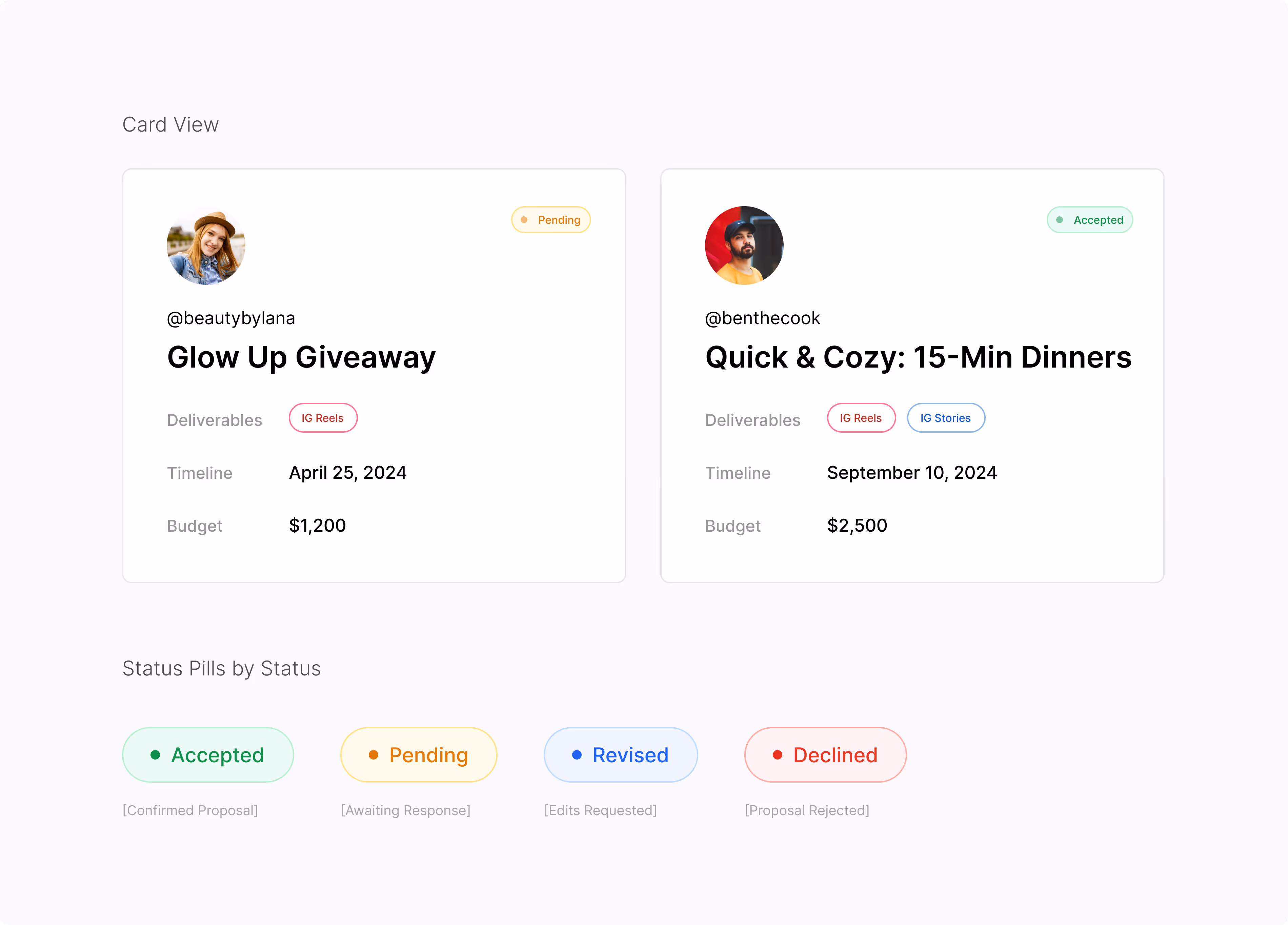
Status At A Glance
We introduced a color-coded status tag for each deal card.
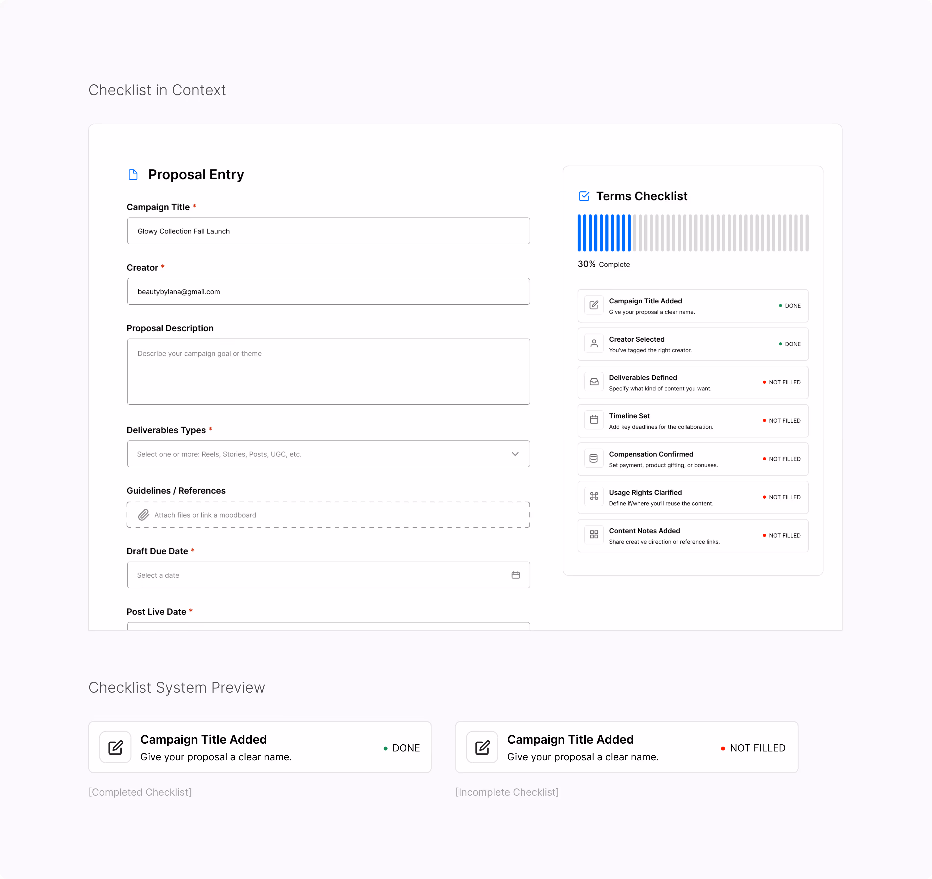
Dynamic Checklist
We added a real-time checklist to the proposal form that updates as each section is filled out. This gives brands peace of mind before hitting “Send,” while preventing small oversights from turning into bigger issues.
For Creators (Mobile)
Clearer Terms Up Front
We surfaced the most important info—like “Timeline”—at the top of the section in large type. Bold headers help creators understand expectations at a glance.
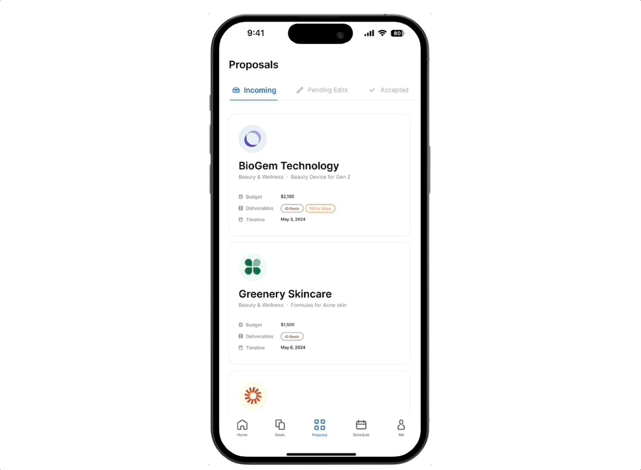
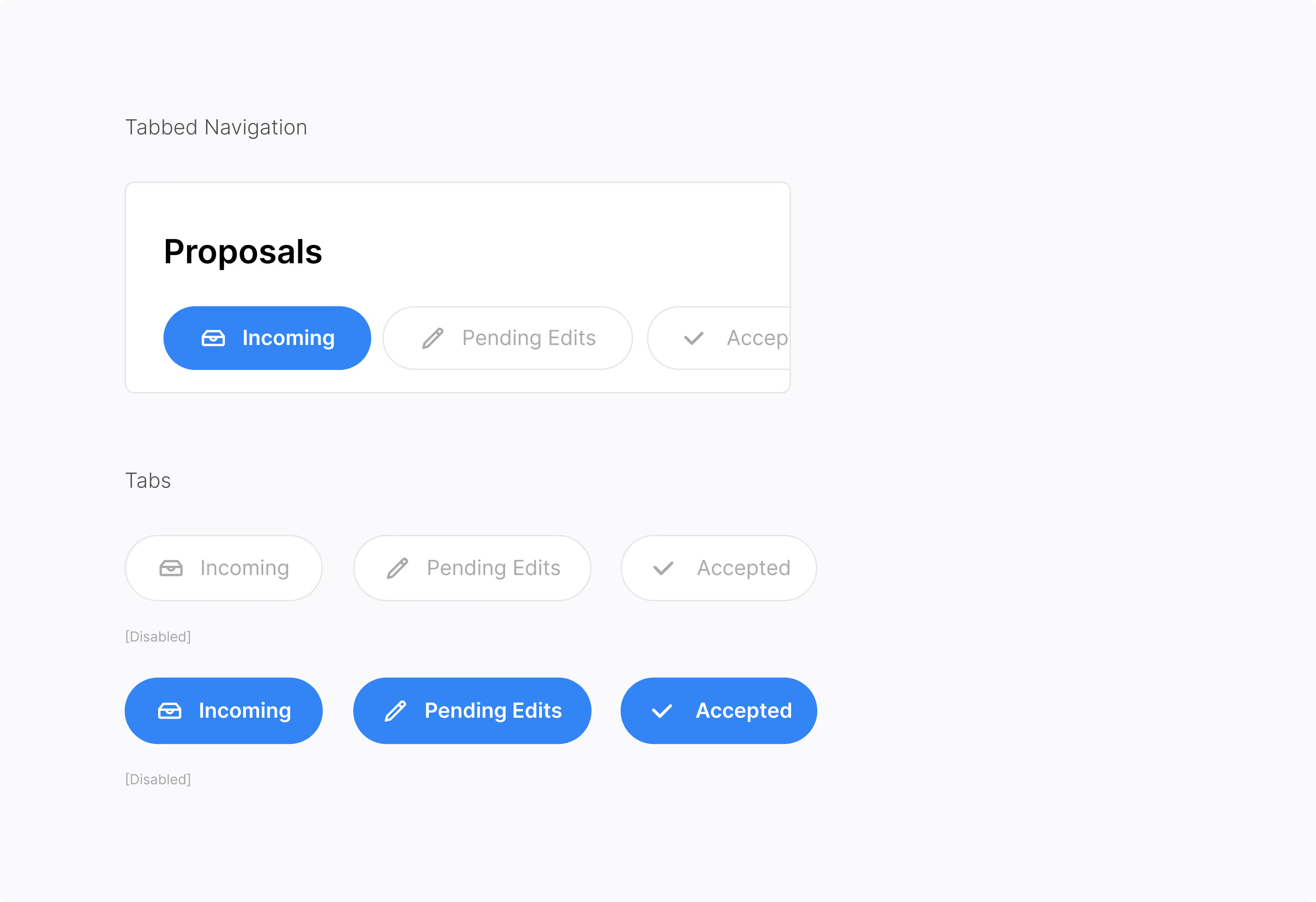
Visual Status Tracking
We designed a tabbed inbox with clear categories: Incoming, Pending Edits, and Accepted. Each proposal card displays a color-coded status pill, keeping everything organized and visible in one place.
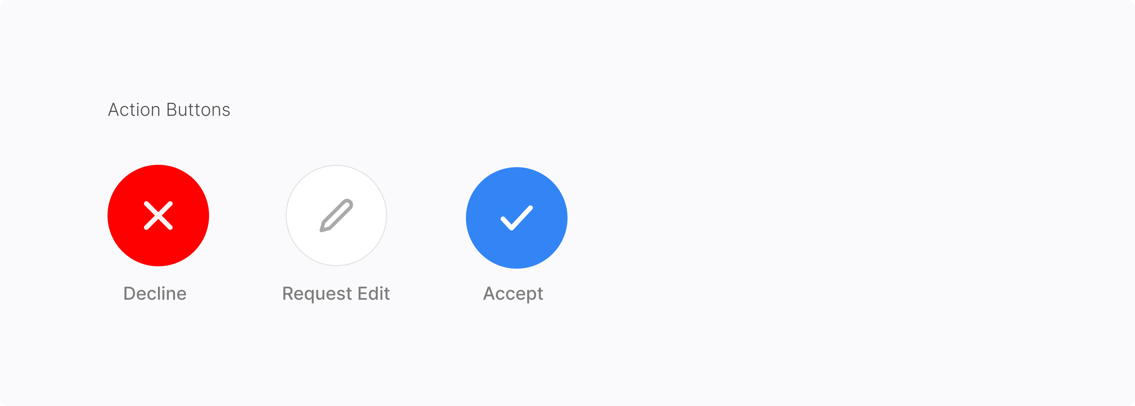
One Tap Responses
To simplify this, we added fixed action buttons—Accept, Request Edits, Decline—anchored at the bottom of the screen. This allows creators to act quickly without scrolling back up, even on mobile.
Iteration
Major Design Improvements
For Brand
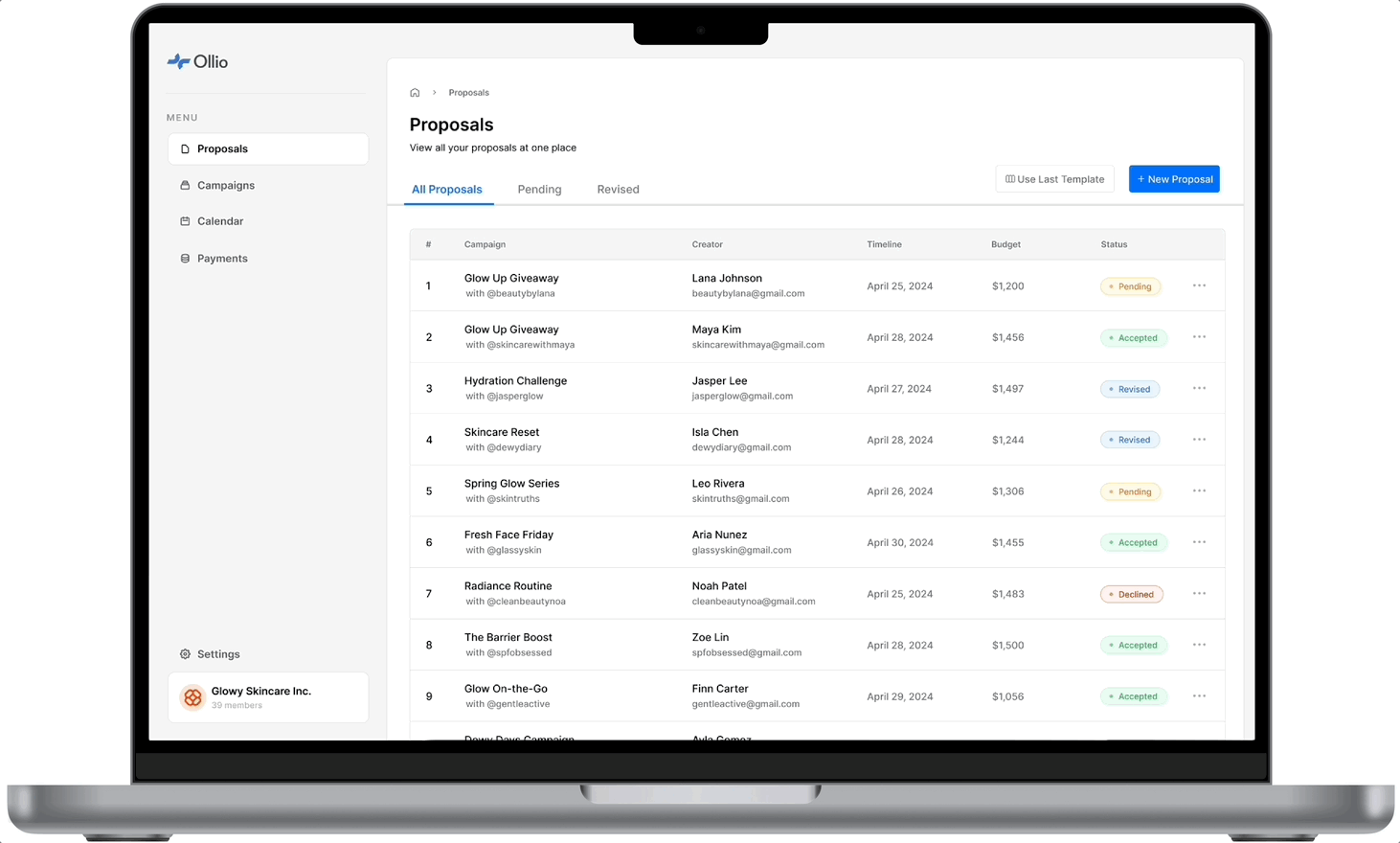
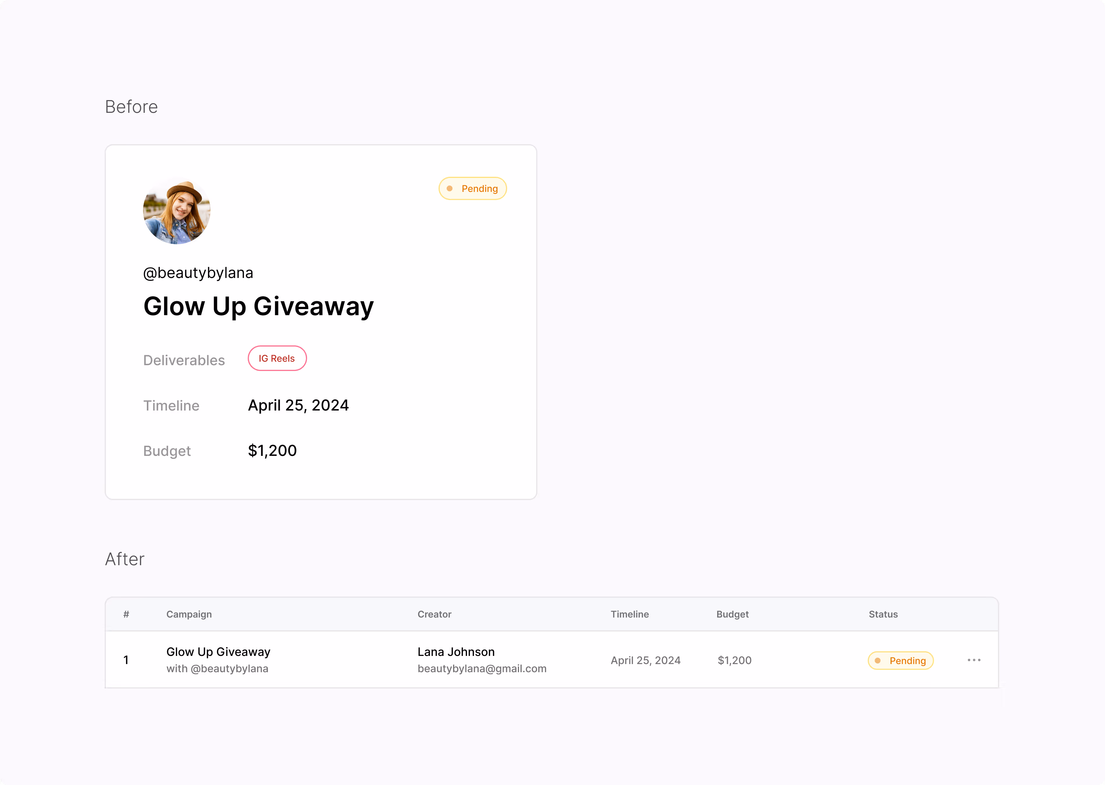
Track More Deals in One Glance
The new table view replaces cards with a compact, column-based layout—allowing brands to scan proposal status, creator names, and deadlines all in one place. It aligns with how marketers already think and work.
For Creator
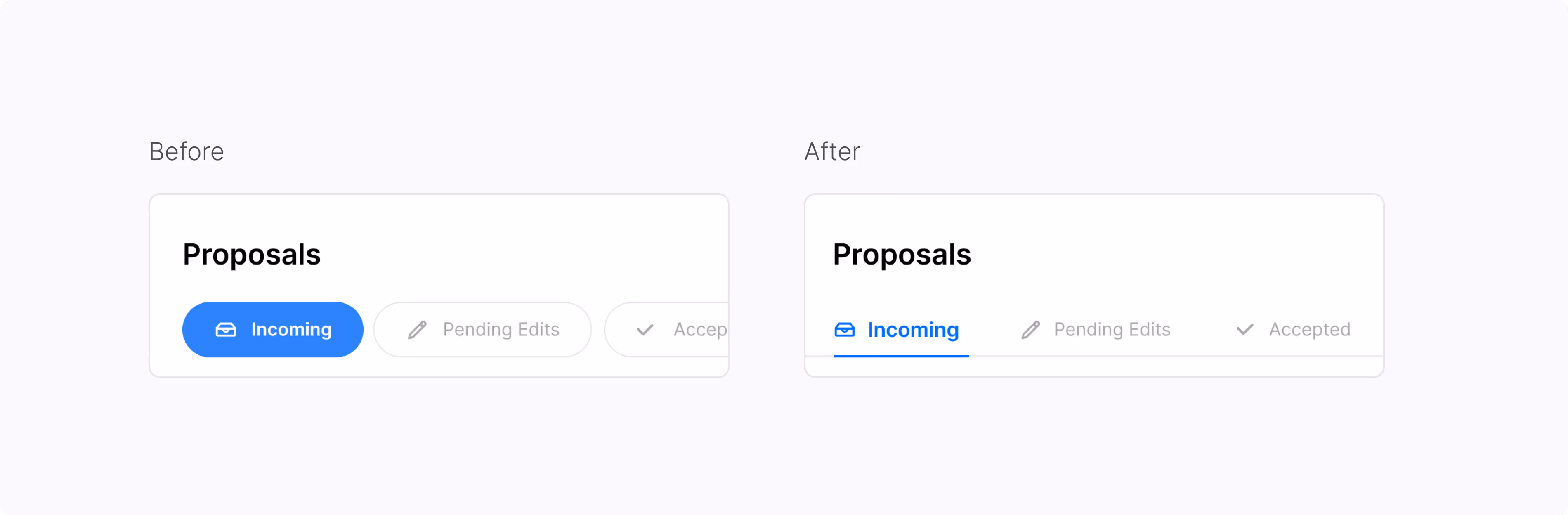
Clarify Deal Status as a Step
Switching to line-style tabs reinforces that Incoming, Pending Edits, and Accepted are part of a sequence. It gives creators a clearer sense of progression and helps reduce confusion around next steps.