Scope Design System
1 Design Lead
1 Tech Lead
(2.5 Months)
Project Context
Scope's inconsistent UI and scattered components slowed development and hurt user experience.
With recent branding updates and a need for scalable design, the team set out to build a unified design system to improve consistency, speed, and usability across the platform.
Problem
Scope had no centralized design system, leading to inconsistent visuals, duplicated components, and longer design-dev cycles.
· With a small team focused on product delivery, there was little time or expertise to create scalable design foundations.
· The mobile experience in particular lacked responsiveness, causing layout issues and poor usability on smaller screens.
Goals
Scope needs to establish a unified design system for both web and mobile platforms to accelerate the design-to-development workflow.
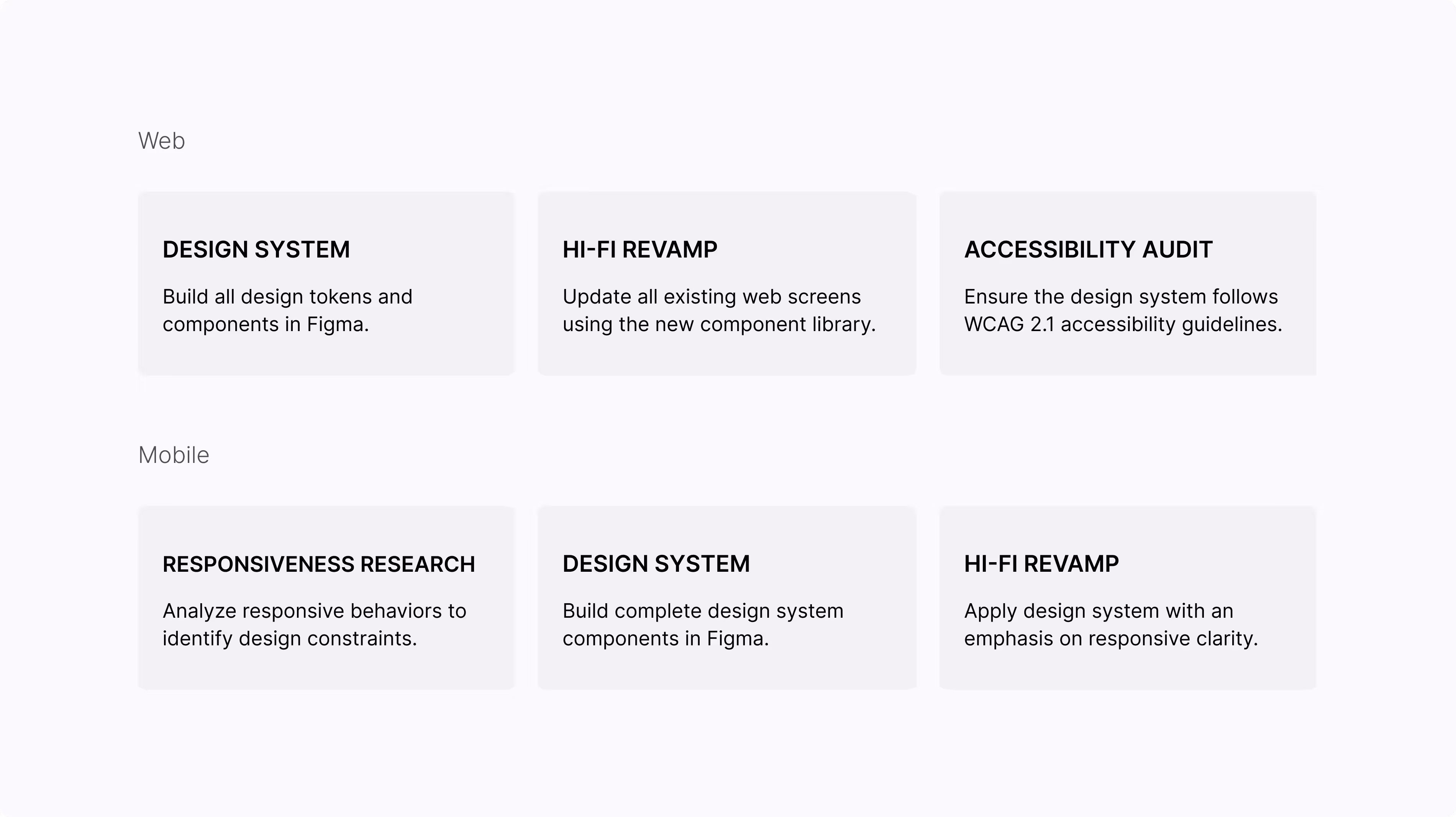
Roadmap
Sprint Overview
Scope’s newly designed product was scheduled to roll out in August 2024. I had 2.5 months to build a full design system and update both the web and mobile platforms. Here's how I broke it down across sprints:
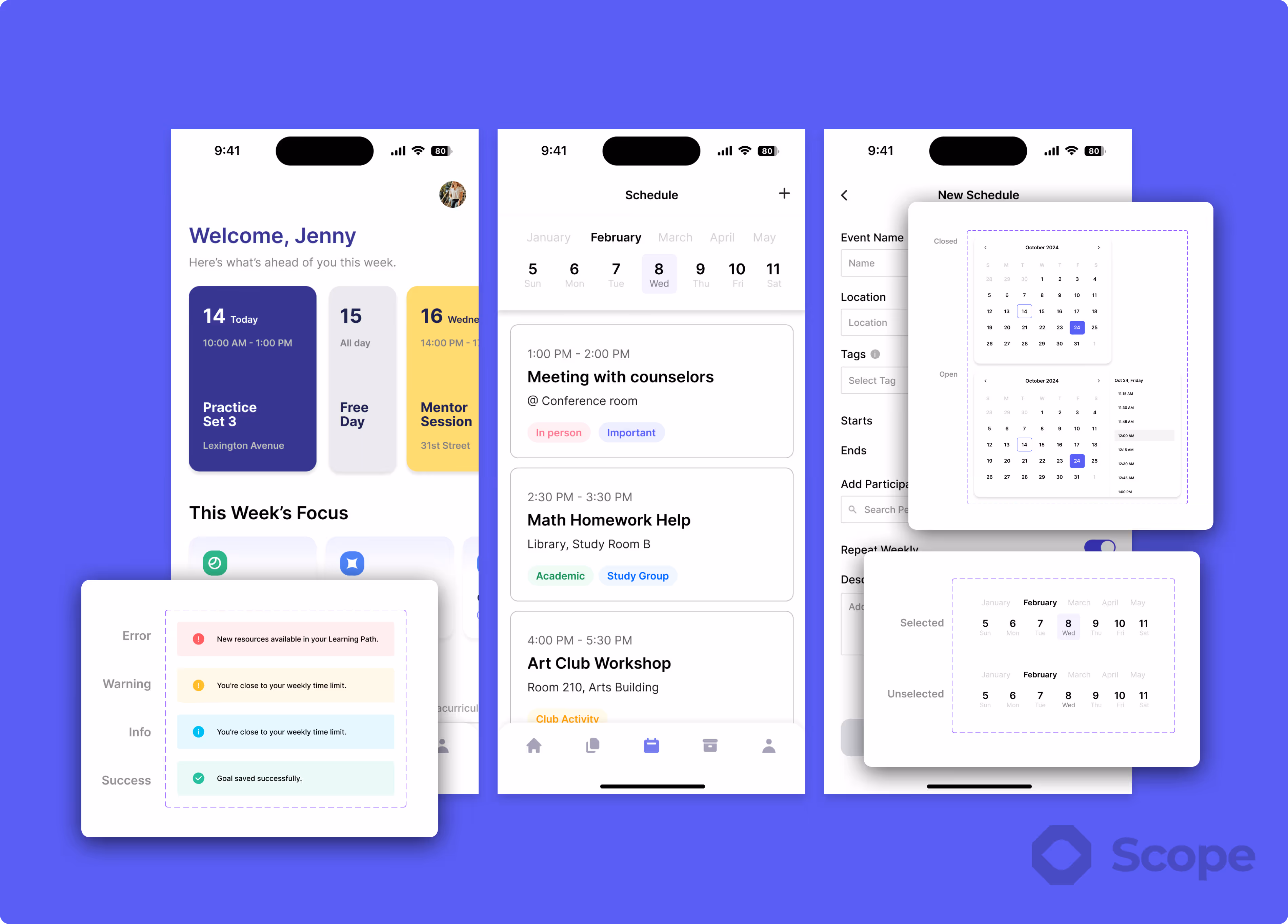
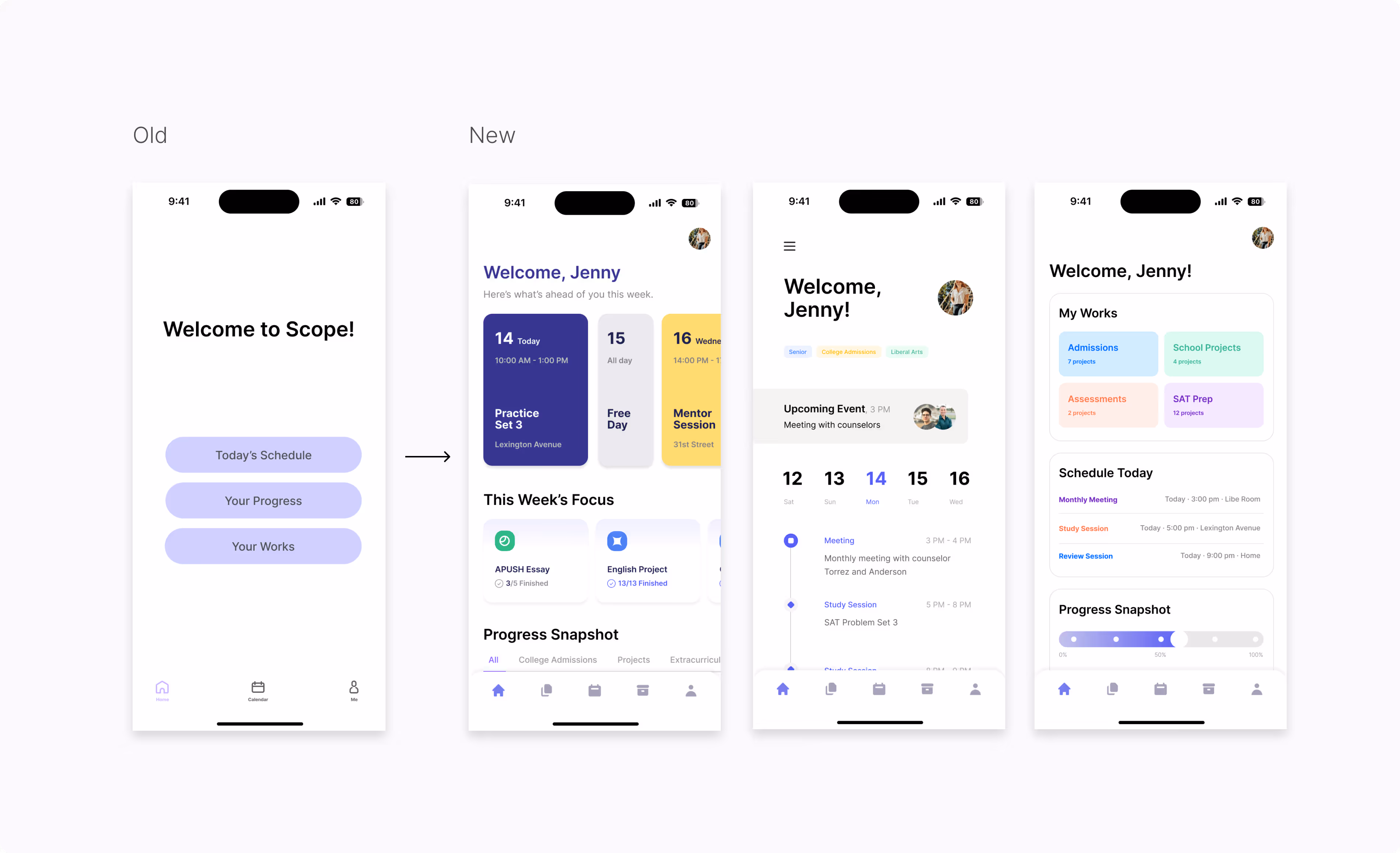
Building Sample
To align stakeholders, I first created mockups for key web and mobile screens using early design tokens like color, type, and spacing.
These samples ensured the visual direction was consistent across platforms and helped validate responsiveness, accessibility, and layout before building the full component library.
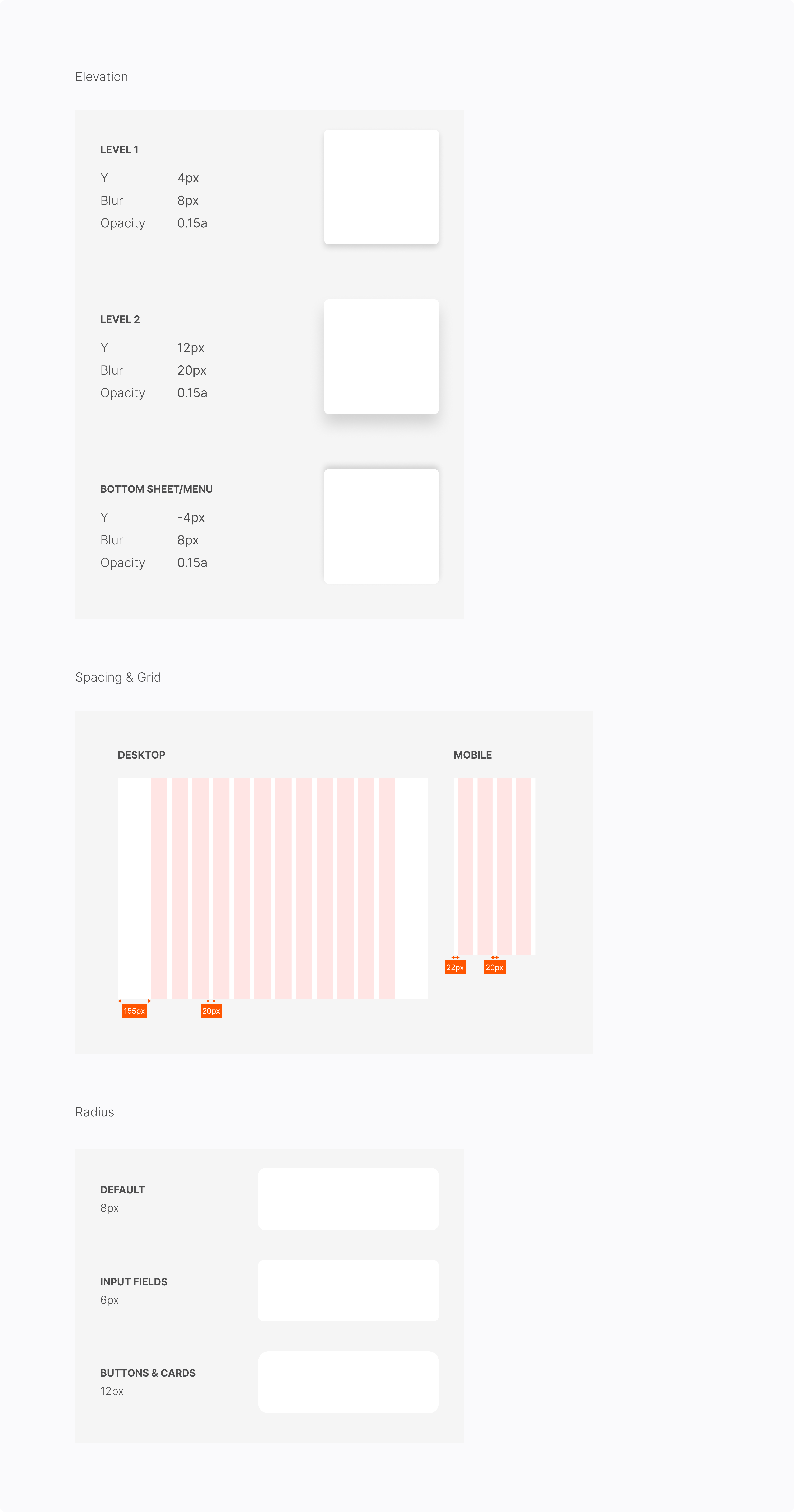
Building Foundation
I first defined foundational design tokens like color, typography, spacing, and elevation to scale Scope's interface across web and mobile.
These tokens ensure visual consistency and allow future components to be built with speed and clarity across devices.
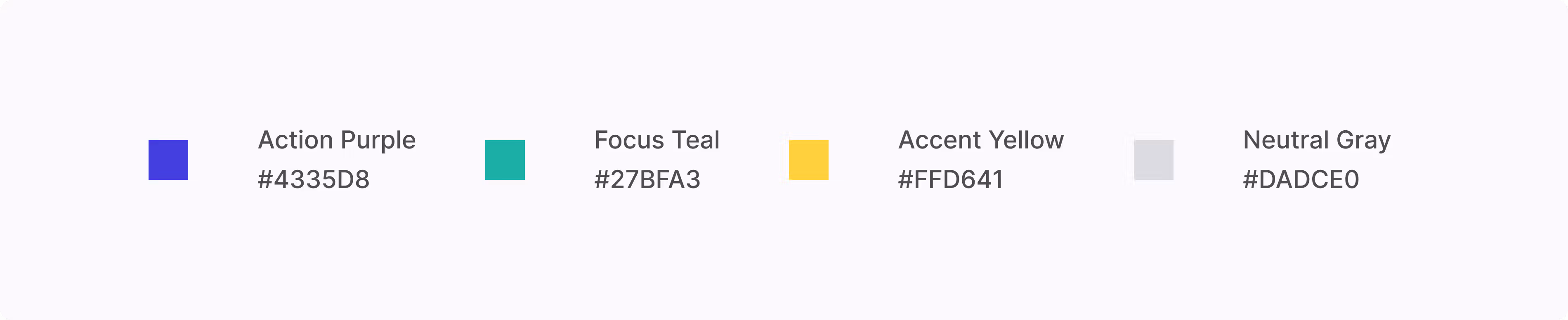
Color
I made a semantic-based color system so each color communicates purpose.
All combinations were tested for accessibility using Material Design’s contrast tools.
Typography
I implemented a dynamic type system that scales across screen sizes and user preferences.
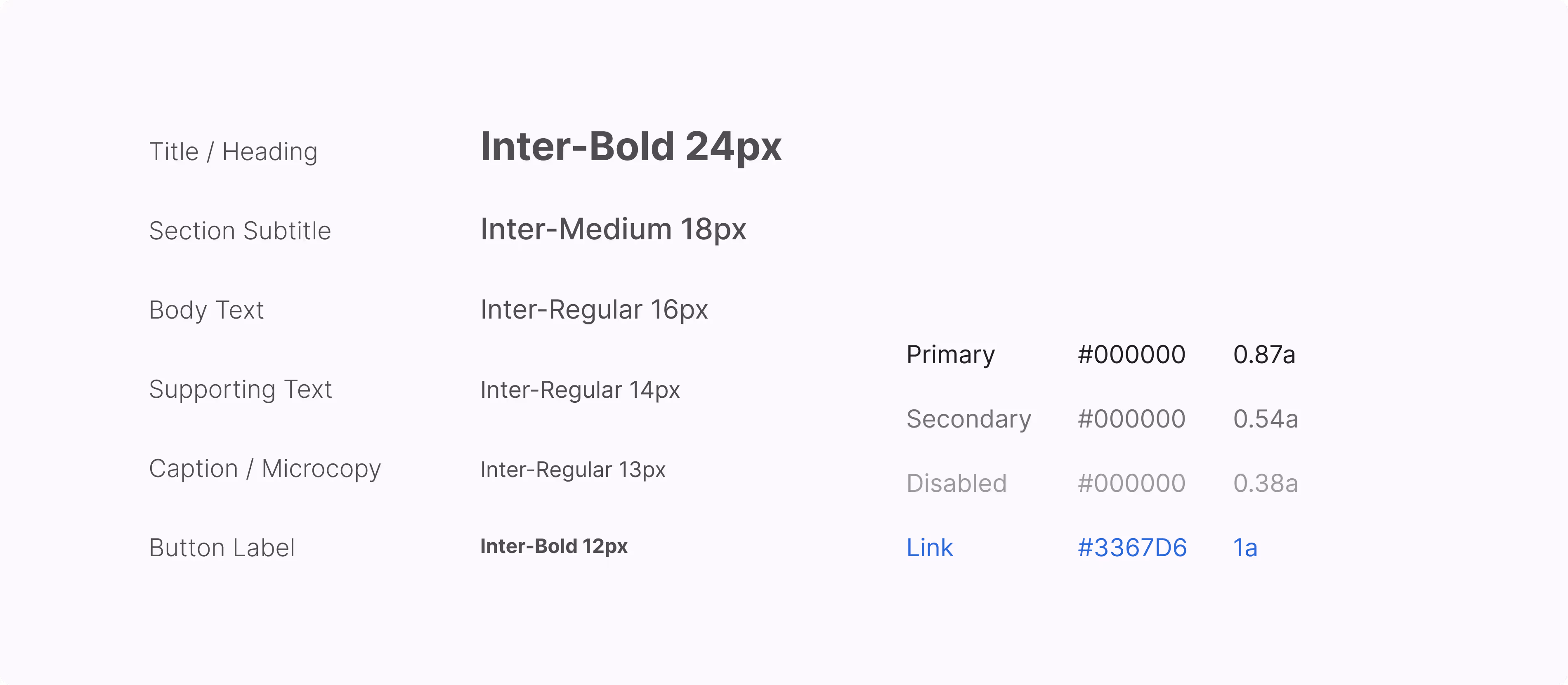
These tokens support layout and subtle interactions across the design system:
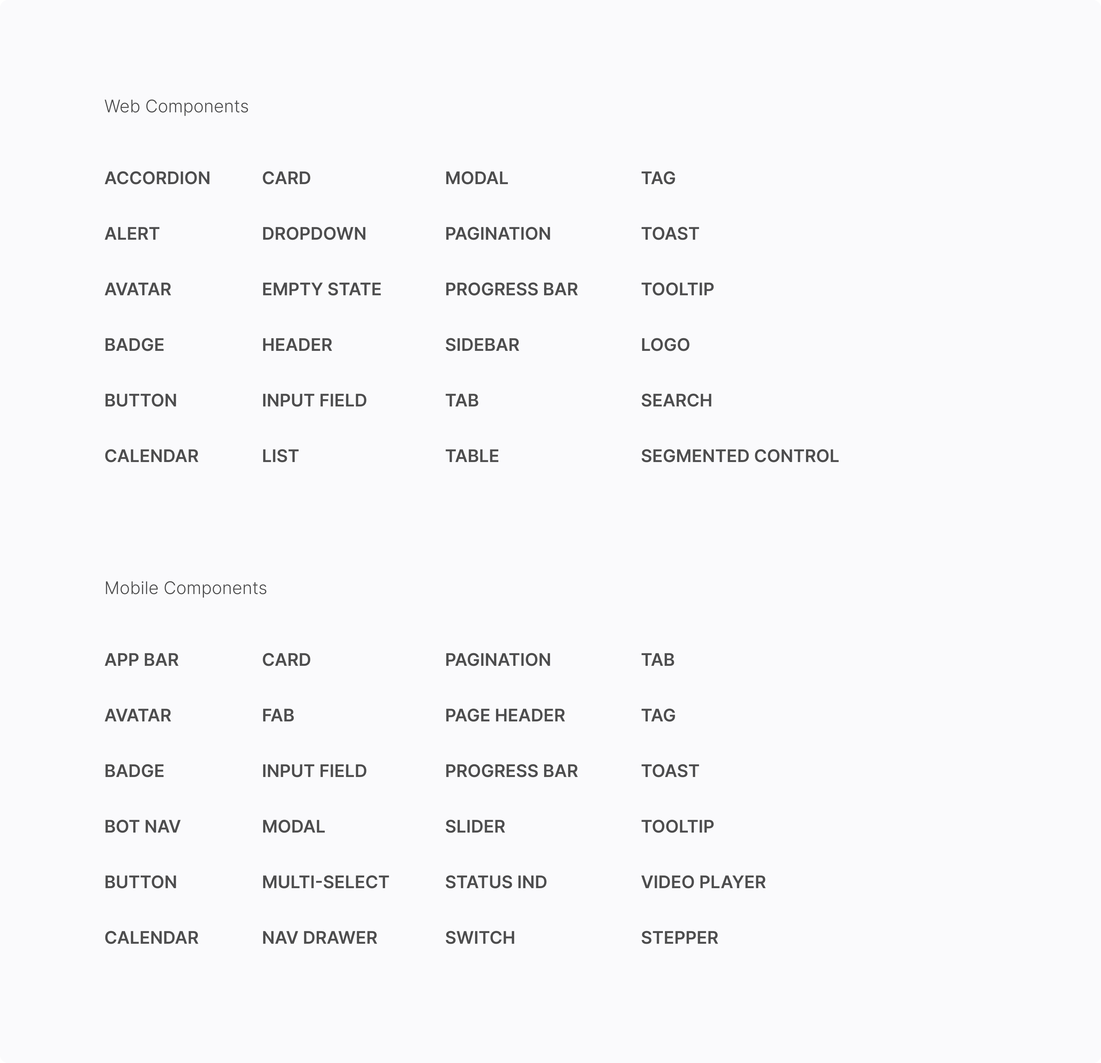
Building Components
To support consistent design across platforms, I built a comprehensive UI component library from scratch.
The categorized lists below outline the full inventory of components I created for each platform.
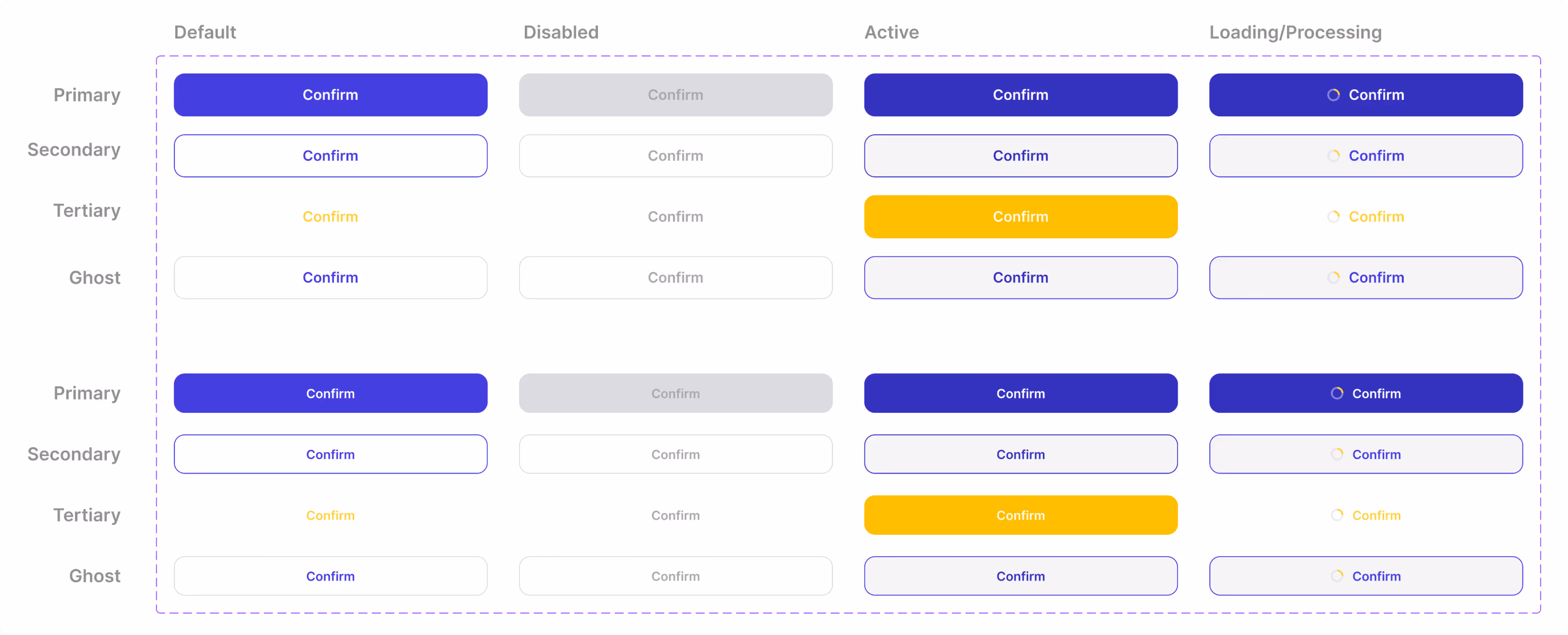
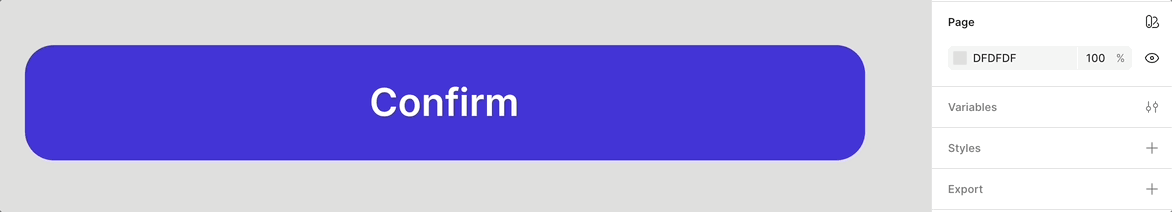
Variants
For each component, I built out all possible states and combined them as variants in Figma.
Designers could simply search by name in the Assets panel, drag the component into their canvas, and toggle settings in the right panel for quick customization.
To ensure adoption, I also ran Figma onboarding sessions and recorded step-by-step video tutorials, so team members could confidently use and contribute to the design system.
Component Setting In Action
Here's how the component settings worked in practice with pre-defined variants and flexible toggles, allowing designers to move from wireframe to high-fidelity mockups in minutes.
Each component was built to balance consistency with creative freedom—offering structure without sacrificing expression.
In Total I've Built
168 Web Components & 211 Mobile Components
Update Interfaces
I redesigned every screen across both web and mobile platforms using the new design system.
This process involved applying a consistent 8pt grid, setting up auto-layouts, and ensuring accessibility across breakpoints. While time-intensive, it gave me full visibility into the product’s structure and ensured every screen aligned with the new visual and interaction standards.
Accessibility Assessment
To ensure the platform was inclusive and accessible, I audited every screen against WCAG 2.1 guidelines, focusing on visual clarity, keyboard navigation, and screen reader compatibility.
Results
Design-to-development cycles were shortened by 2 times.
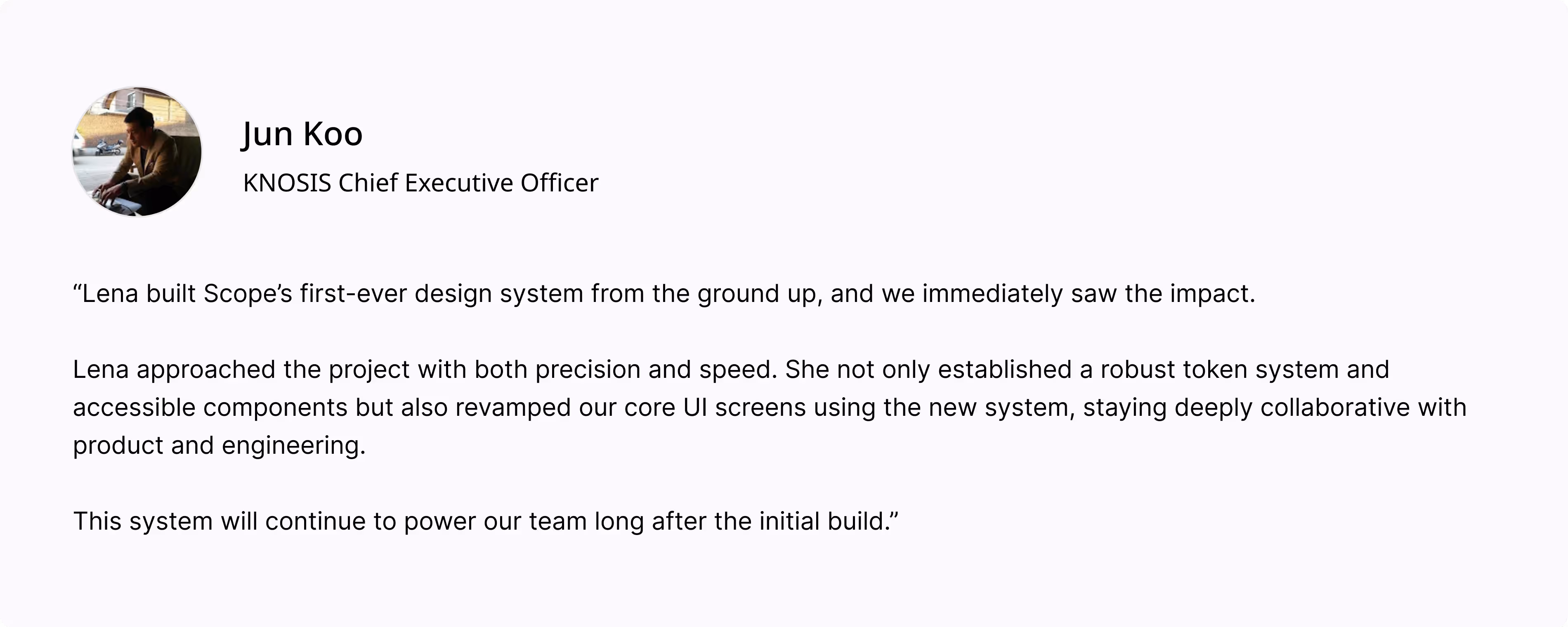
Feedback